Bay Area SCAN weekly update 4/19/23
This blog post describes data collected at 8 wastewater treatment plants in the Greater Bay Area of San Francisco, CA, including Sacramento, that are partners in the SCAN project which began in late 2020.
All samples picked up by the couriers as of 4/17/23 have been processed and their data are on the site: wbe.stanford.edu. The data from the SCAN sites are also on data.wastewaterscan.org. Please email Amanda Bidwell at albidwel@stanford.edu if you identify any bugs on the site.
COVID-19
SARS-CoV-2 and Variants
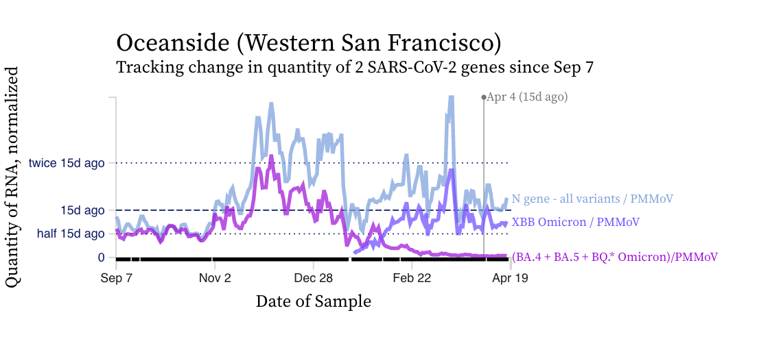
SARS-CoV-2 N gene concentrations at SCAN sites are similar to what they were two weeks ago. Concentrations are approximately between 100,000 copies per gram and 500,000 copies/g, still well above our lower detection limit of approximately 1,000 copies/g. Below is a chart showing data from the Oceanside plant in San Francisco showing similar concentrations in the N gene concentration (blue line) relative to two weeks ago.
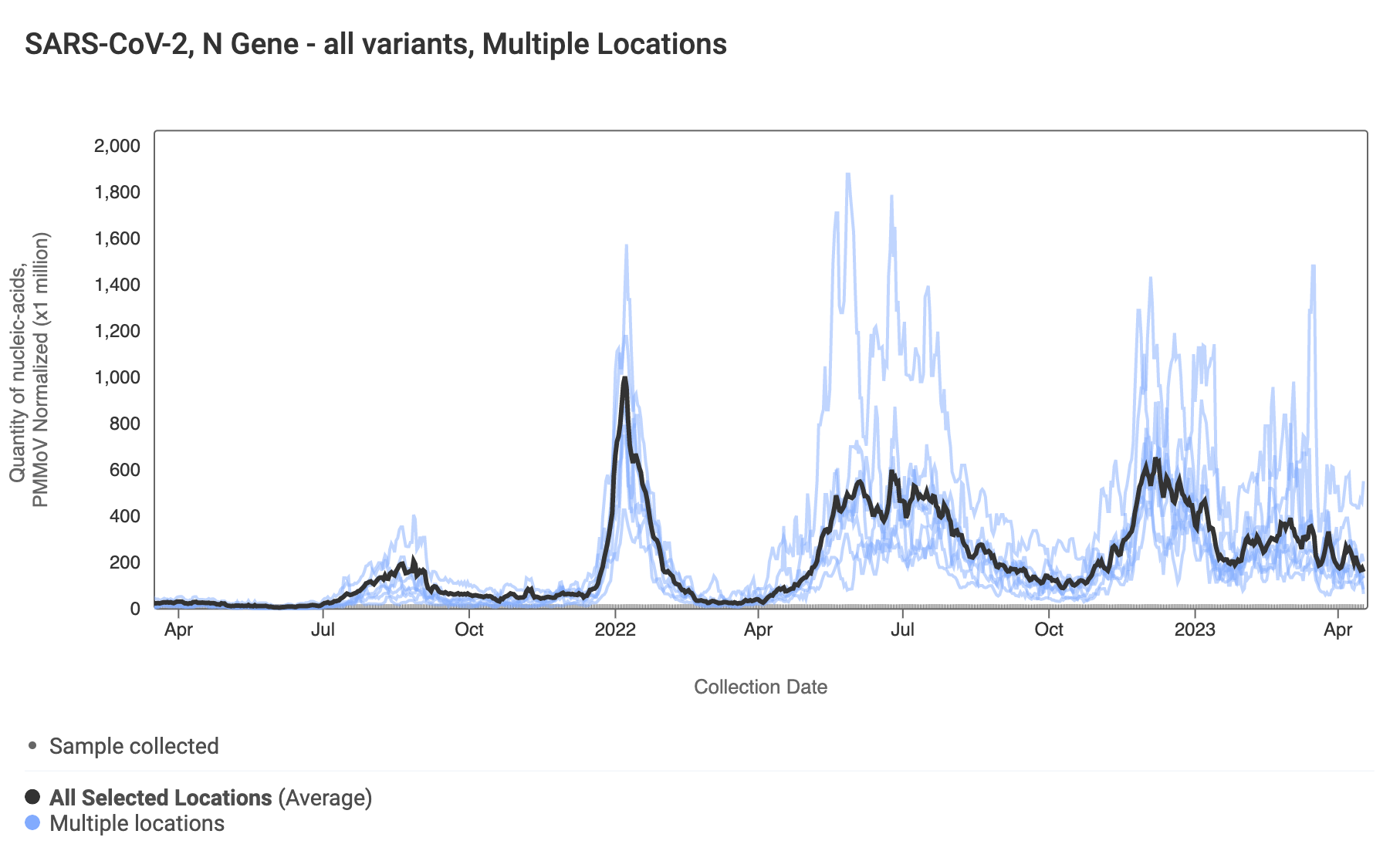
Here are the data from all the SCAN plants together for the last year. You can access the graph here. You can see we have added functionality of a population weighted average line over the data from all the SCAN plants (shown in black). You can see the levels are slowly decreasing, based on the population-weighted average.
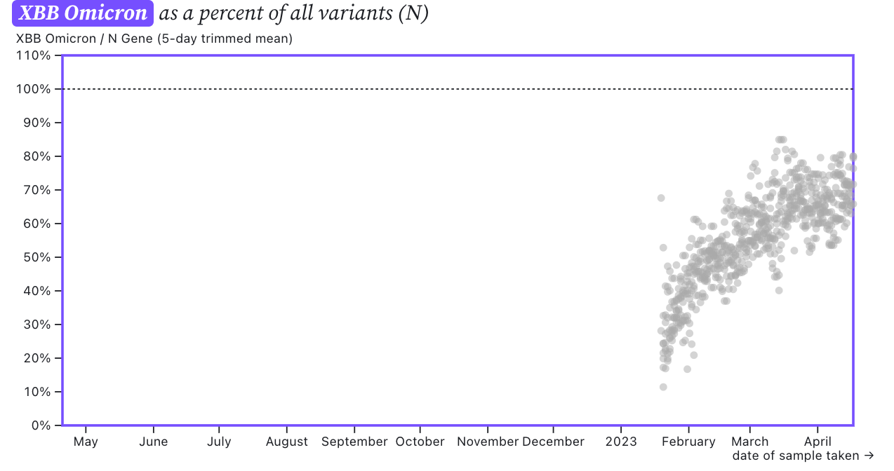
The chart from Oceanside (2 plots above) shows that the mutation marker for XBB* (shown in violet) is closer to the blue line (showing the N gene, present in all variants) than the bright purple line (showing the mutation present in the BQ* and BA.5 sublineages). This indicates that most of the individuals shedding SARS-CoV-2 in the sewersheds are likely infected with and shedding XBB* rather than another variant. We see the pattern across all the sewersheds in SCAN. The assay we use for XBB* will detect XBB.1.16* as well as XBB.1.9* which are emerging XBB*. We detected XBB.1.16 in wastewater from Oceanside on 3/30/23 and 4/6/23, as well as in Sacramento wastewater on 4/6/23. The sequencing data is a couple weeks delayed from the present time. So present occurrence of the XBB.1.16 sublineage could be greater.
The ratio of the XBB* mutations/N across SCAN plants is shown in the chart below. It looks similar to the chart from last week. As the ratio reaches 100%, it suggests that all the SARS-CoV-2 genomes in wastewater have the XBB* mutations. These data indicate that the regional average ratio XBB* mutations/N is ~75%-80%. These are about the same as last week. These data suggest that the majority of infections across the SCAN communities are caused by XBB*.
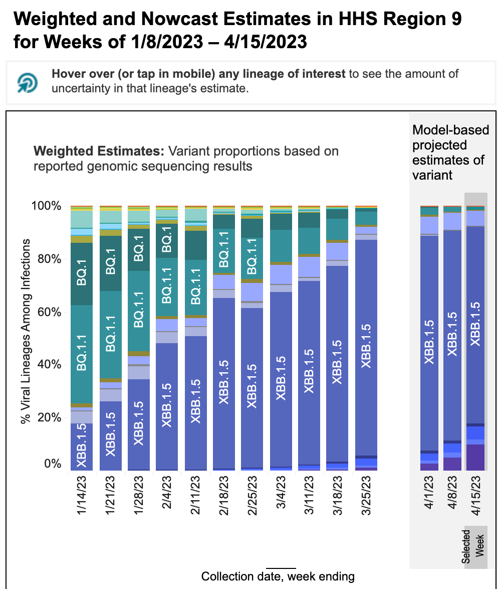
These data from wastewater solids on SARS-CoV-2 variants is consistent with the results from the CDC Nowcast for HHS region 9 (which includes CA). The nowcast suggests nearly all infections in HHS region 9 are caused by XBB* and <5% by BQ* (see screen shot from website below). 5-17% of infections are modeled to be caused by XBB.1.16 and the proportion of XBB.1.16 infections has been modeled to have increased rapidly over the last three weeks (it is the dark purple in the bar charts at the bottom). These model projections for XBB* are higher than what we see in the wastewater. It is important to note that the clinical sample sequencing data used to make the CDC nowcast charts is only available as recently as a month ago (week of 3/25/23 in the chart below) and the rest of the data are model-based predictions.
Other Respiratory Viruses
IAV, IBV, RSV, and HMPV
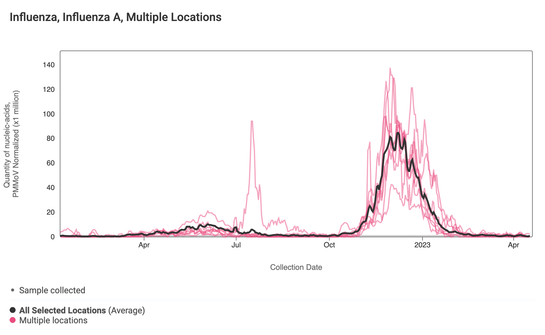
Influenza A (IAV) RNA concentrations are very low across the SCAN plants. Concentrations are generally non-detects in samples from recent weeks. The link to the chart is here if you would like to interact with it. You can see we have added functionality of a population weighted average line over the data from all the SCAN plants (shown in black).
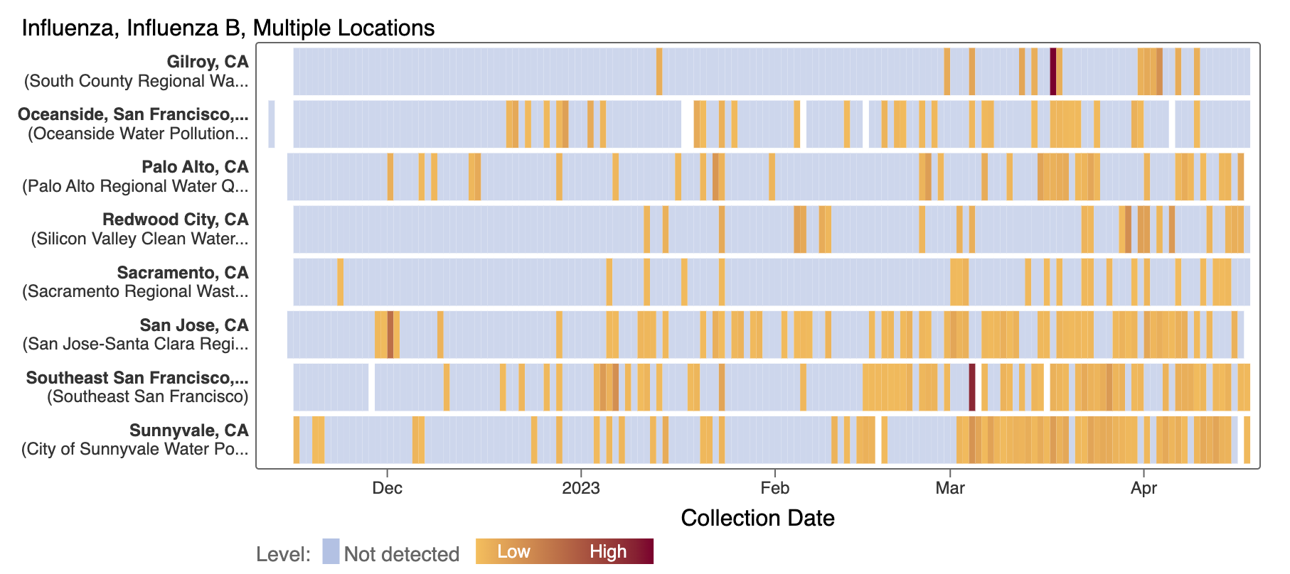
Influenza B (IBV) RNA continues to be sporadically detected at low concentrations at the SCAN plants. Each plant is represented by a row (y-axis), and dates are shown along the x-axis. Blue indicates a non-detect, and darker orange/red is proportional to concentration with the highest values being darkest. A white means no sample was collected. Here is the link to the heat map chart - the linked chart will update automatically as more data are added to the site.
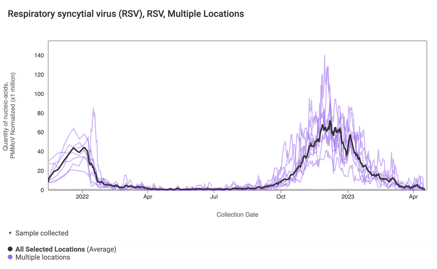
RSV RNA has been non-detectable in some samples from some plants over the last week with some low level detections. This plot shows data from all the SCAN sites together since last winter and can be access here. The black line is the population weighted average.
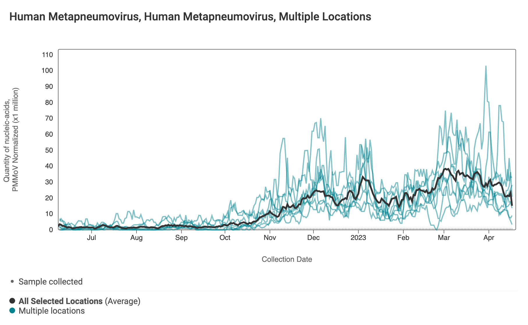
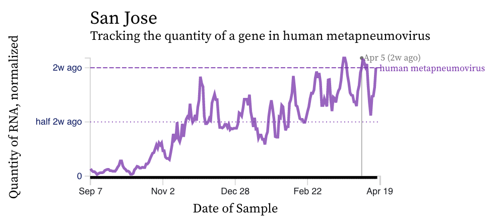
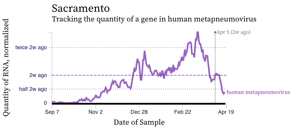
HMPV (human metapneumovirus) RNA concentrations trends are variable across plants. Concentrations are between 10,000 and 50,000 copies/g dry weight. Below are charts showing data from all the SCAN plants together (link here to this chart if you want to interact with it), and just San Jose (increasing trend, relatively high levels), and just Sacramento (decreasing trend, decreasing levels). The pattern here is quite distinct from influenza and RSV and suggests this virus is still circulating in the communities.
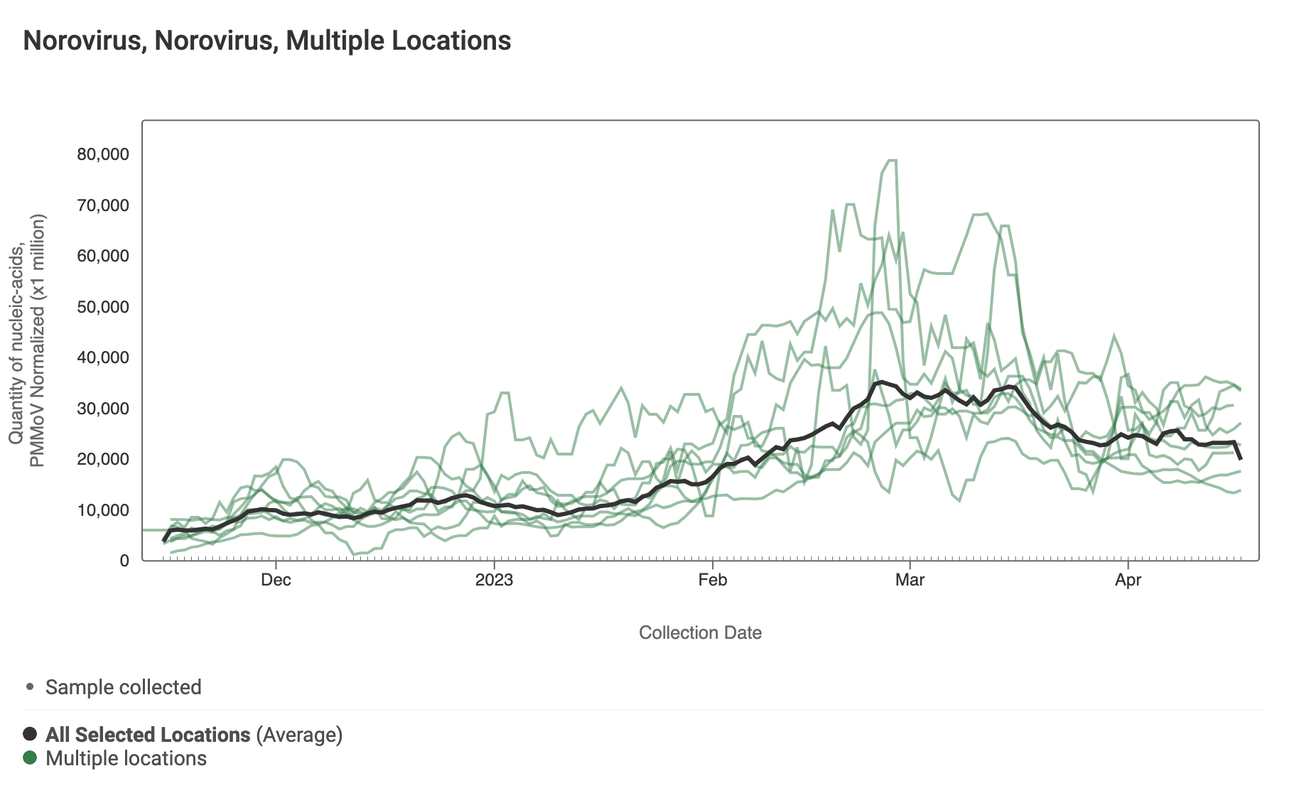
Norovirus
Assay detects human norovirus GII
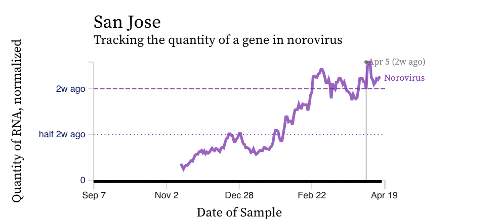
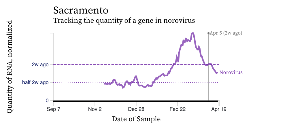
Norovirus GII RNA concentrations have taken a down turn at most plants, but San Jose is being stubborn and is still high. A chart of all the SCAN plants together is shown below. The population weighted average line is shown in black. Also we are showing just San Jose where concentrations are still increason, and then just Sacramento where concentrations have really begun to decrease. You can interact with the chart of all the plants at this link.
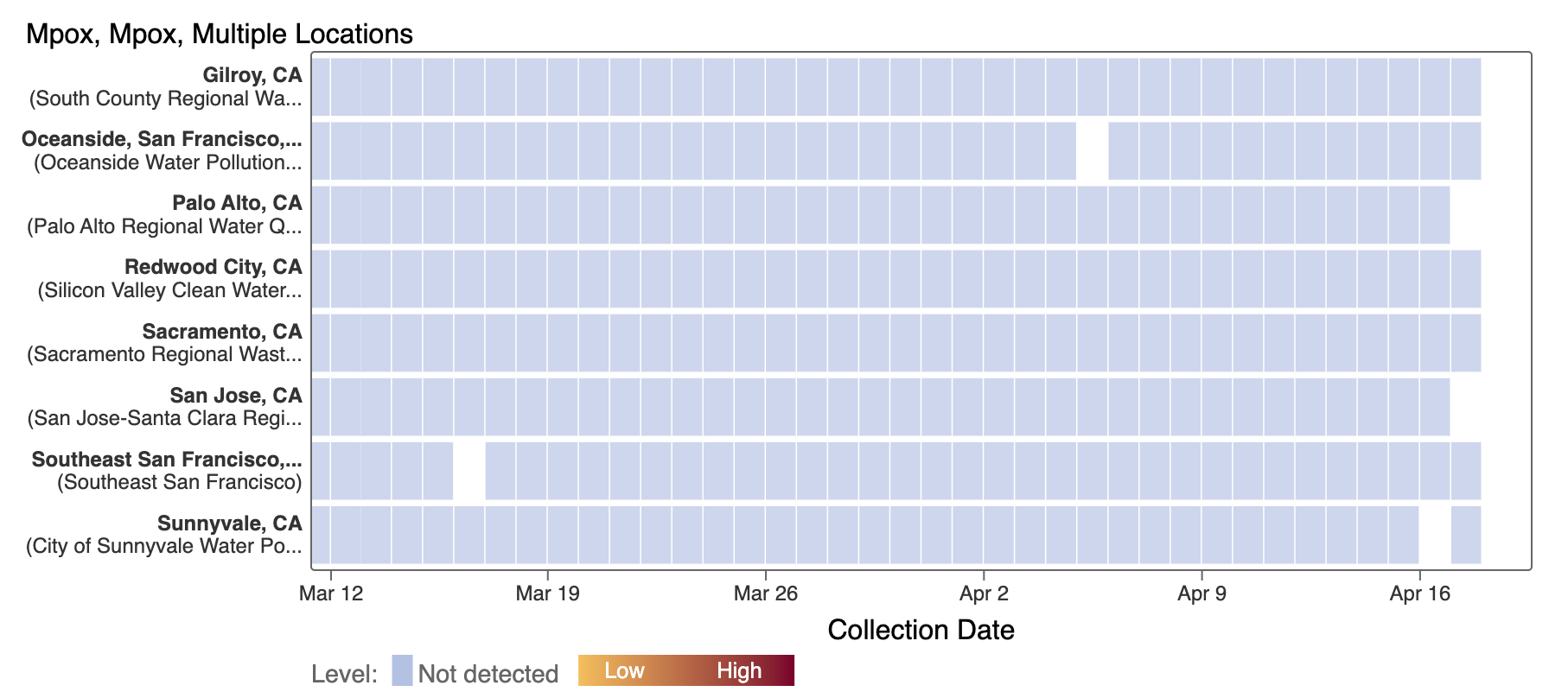
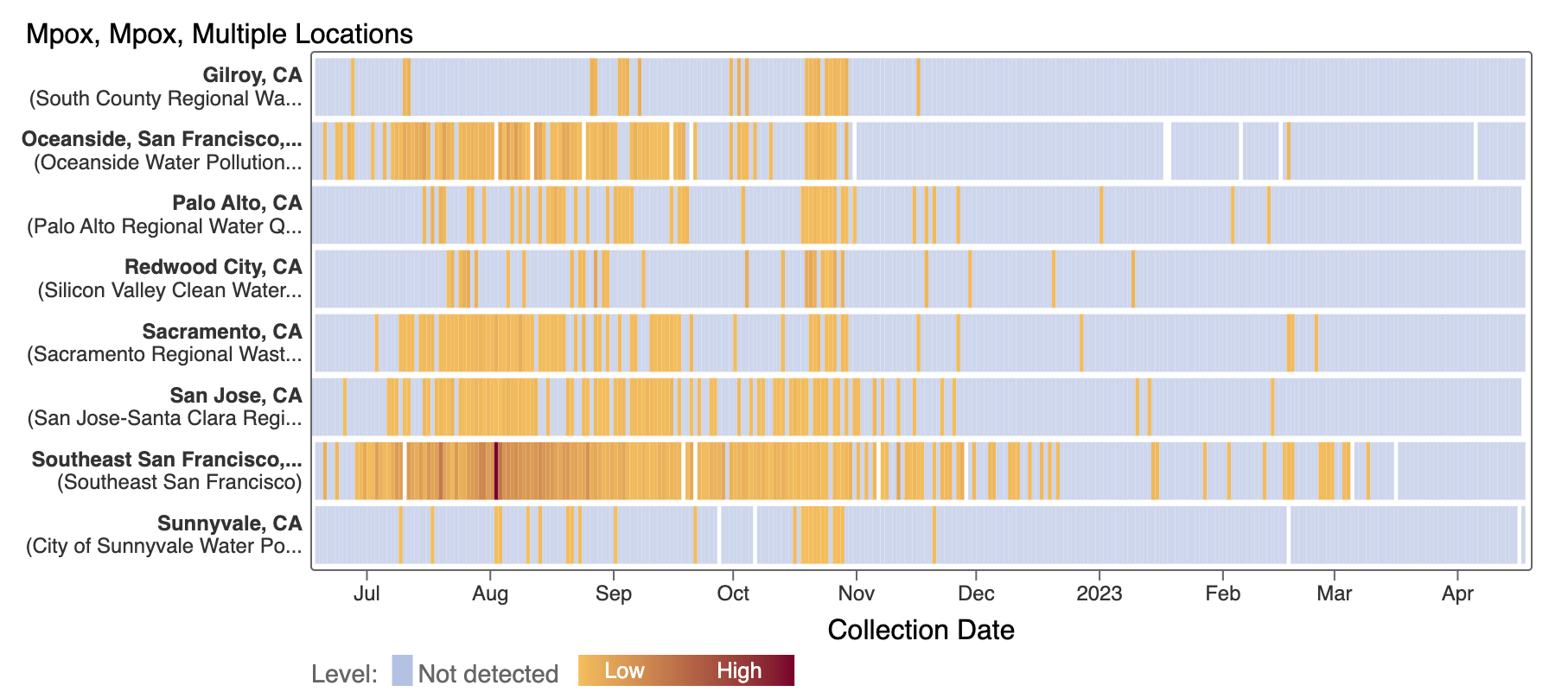
Mpox
We've observed non-detects in the past month for MPXV DNA at the SCAN plants. These heat maps show all the SCAN sites as a row, and each date as a column. The color blue means the sample was non-detect for MPXV DNA and the colors get darker with higher concentrations. The top chart shows just recent data, and the bottom one all the data we have collected, almost a year's worth of data. You can access these plots here.