Bay Area SCAN weekly update 5/3/23
This blog post describes data collected at 8 wastewater treatment plants in the Greater Bay Area of San Francisco, CA, including Sacramento, that are partners in the SCAN project which began in late 2020.
All samples picked up by the couriers as of 5/1/23 have been processed and their data are on the site: wbe.stanford.edu. The data from the SCAN sites are also on data.wastewaterscan.org. Please email Amanda Bidwell at albidwel@stanford.edu if you identify any bugs on the site.
COVID-19
SARS-CoV-2 and Variants
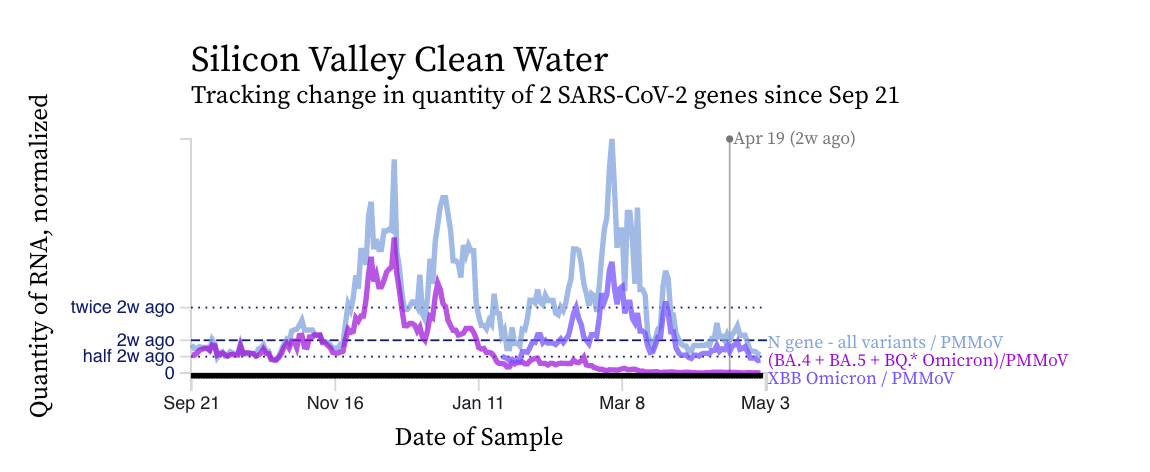
SARS-CoV-2 N gene concentrations at SCAN sites are similar to what they were two weeks ago. Concentrations are still approximately 100,000 copies/g, still well above our lower detection limit. Below is a chart showing data from the Silicon Valley Clean Water plant showing similar concentrations in the N gene concentration (blue line) relative to two weeks ago.
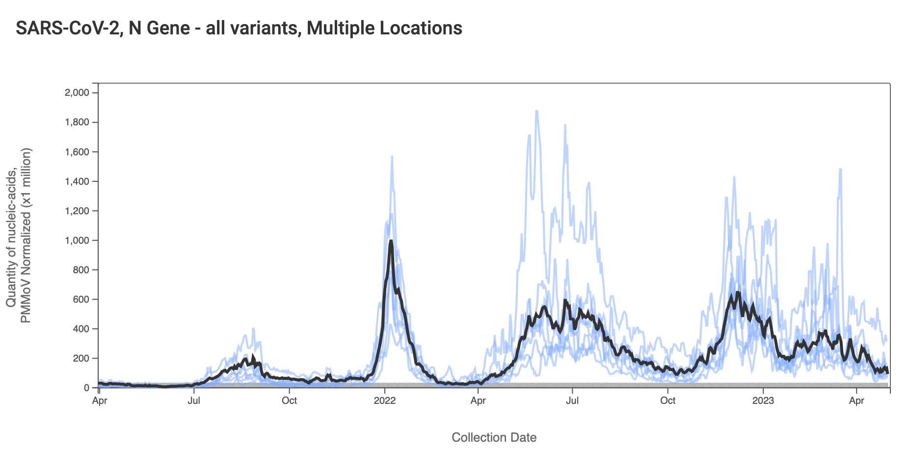
Here are the data from all the SCAN plants together for the 2.5 years. You can access the graph here. You can see we have added functionality of a population weighted average line over the data from all the SCAN plants (shown in black). You can see the levels are currently slowly decreasing, based on the population-weighted average.
The chart from Silicon Valley Clean Water (2 plots above) shows that the mutation marker for XBB* (shown in violet) is close to the blue line (showing the N gene, present in all variants), and the bright purple line (showing the mutation present in the BQ* and BA.5 sublineages) is basically at 0. This indicates that most of the individuals shedding SARS-CoV-2 RNA in the sewersheds are infected with and shedding XBB* rather than another variant. We see the pattern across all the sewersheds in SCAN. The assay we use for XBB* detects XBB.1.16 as well as XBB.1.9 and FD.2 which are emerging XBB*. We detected XBB.1.16 in wastewater from Oceanside wastewater treatment plant in SF on 3/30/23 4/6/23, 4/16/23, and 4/23/23, as well as in Sacramento wastewater on 4/6/23 and 4/20/23, and San Jose on 4/12/23 and 4/22/23 using sequencing approaches. The data suggest that the sublineage is present, but rare, in the wastewater as of the third week of April. The sequencing data is a couple weeks delayed from the present time.
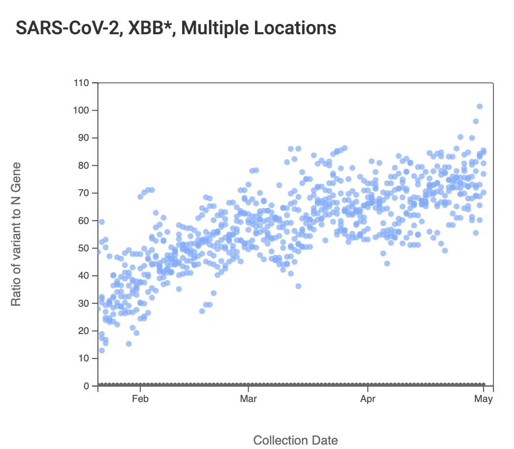
The ratio of the XBB* mutations/N across SCAN plants is shown in the chart below. It looks similar to the chart from last week, but this chart comes from data.wastewaterscan.org (link here to the chart). As the ratio reaches 100%, it suggests that all the SARS-CoV-2 genomes in wastewater have the XBB* mutations. These data indicate that the regional average ratio XBB* mutations/N is ~75%-80%. These are about the same as last week. These data suggest that the majority of infections across the SCAN communities are caused by XBB*.
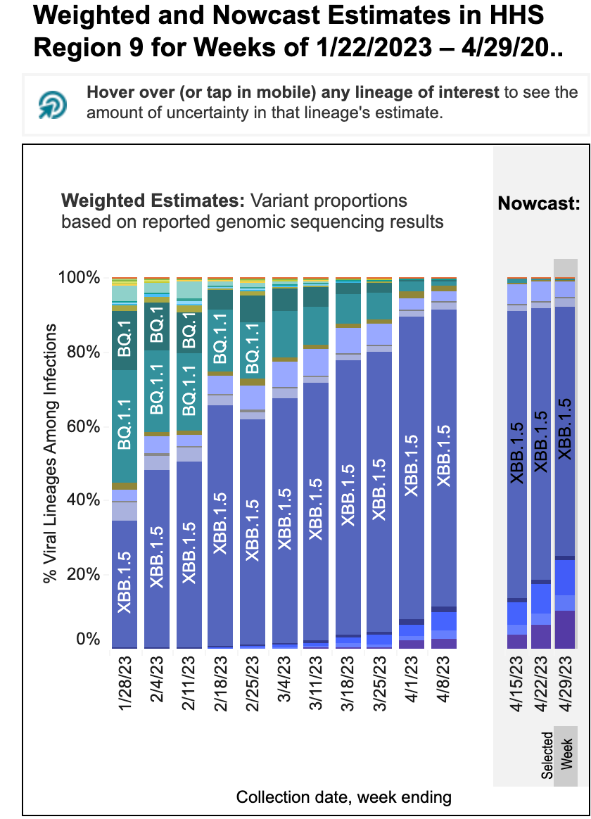
These data from wastewater solids on SARS-CoV-2 variants are consistent with the results from the CDC Nowcast for HHS Region 9 (which includes CA). The nowcast suggests nearly all infections in HHS Region 9 are caused by XBB*. 10% of infections are modeled to be caused by XBB.1.16 this week, and the proportion of XBB.1.16 infections has been modeled to have increased rapidly over the last three weeks (it is the dark purple in the bar charts at the bottom). A new XBB* (XBB.1.5.15, also called FD.2) is modeled to be causing 2% of infections this week.
The CDC nowcast model projections for XBB* are higher than what we see in the wastewater. The reason for this could be (1) the CDC model projections are not applicable to SCAN plants (they are for all of HSS Region 9), (2) there is another variant without the XBB* mutations we measure circulating, or (3) the XBB* circulating on our region do not have one or more of the mutations that we target with our assay (unlikely).
Other Respiratory Viruses
IAV, IBV, RSV, and HMPV
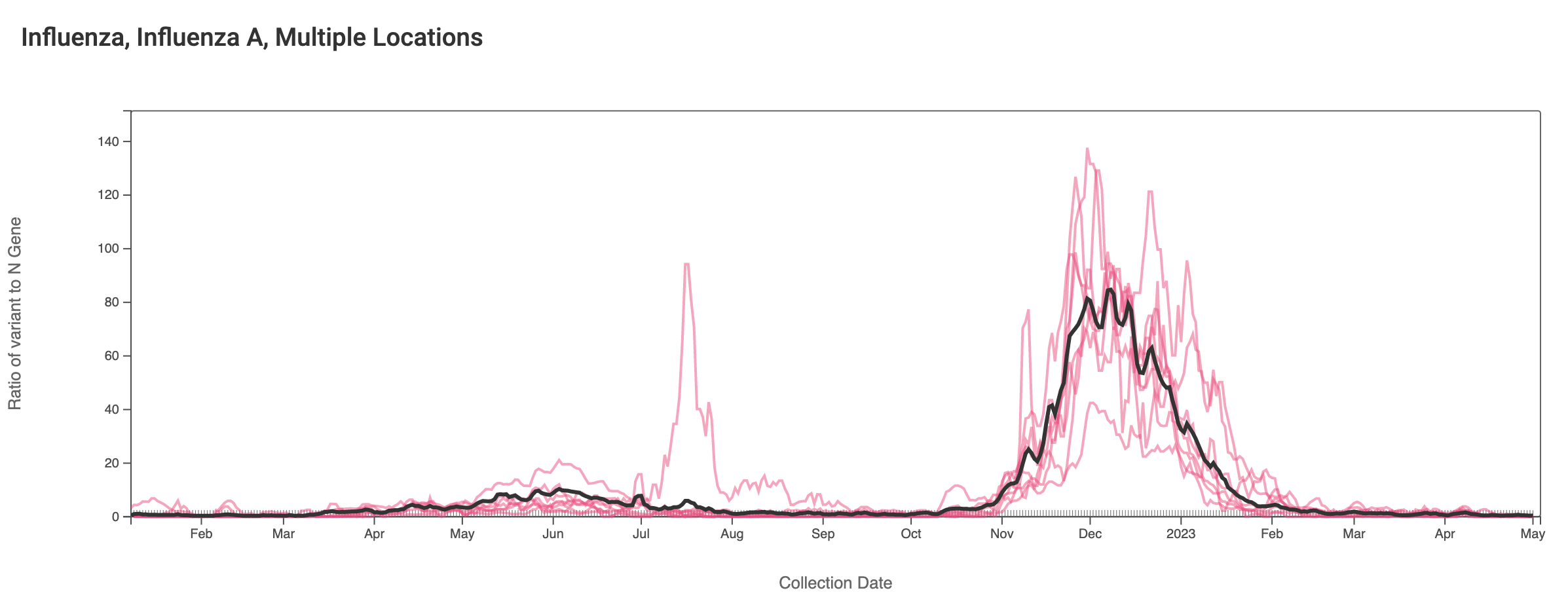
Influenza A (IAV) RNA concentrations are very low across the SCAN plants. Concentrations are generally non-detects in samples from recent weeks. The link to the chart below is here if you would like to interact with it.The population weighted average line across all the SCAN plants is shown in black.
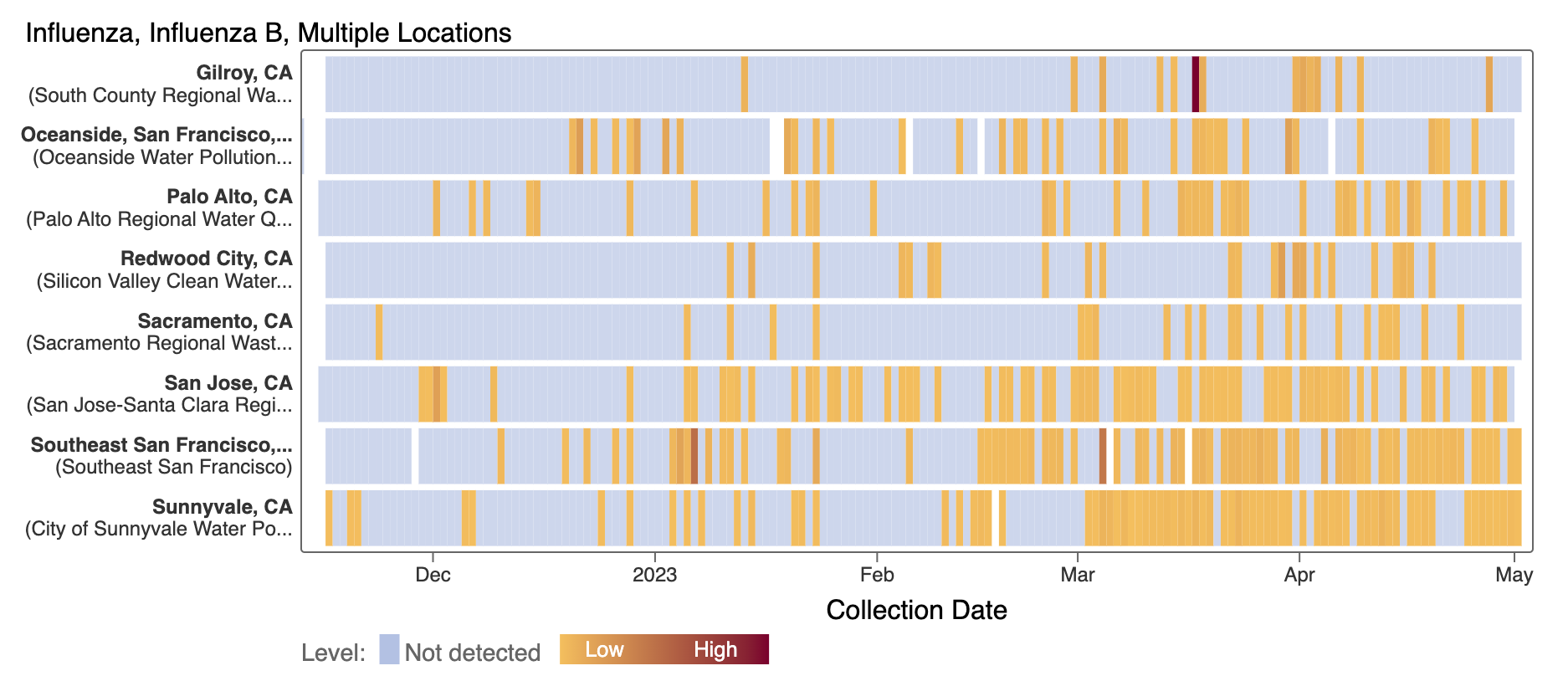
Influenza B (IBV) RNA is sporadically detected at low concentrations at the SCAN plants. Each plant is represented by a row (y-axis), and dates are shown along the x-axis. Blue indicates a non-detect, and darker orange/red is proportional to concentration with the highest values being darkest. A white means no sample was collected. Here is the link to the heat map chart - the linked chart will update automatically as more data are added to the site.
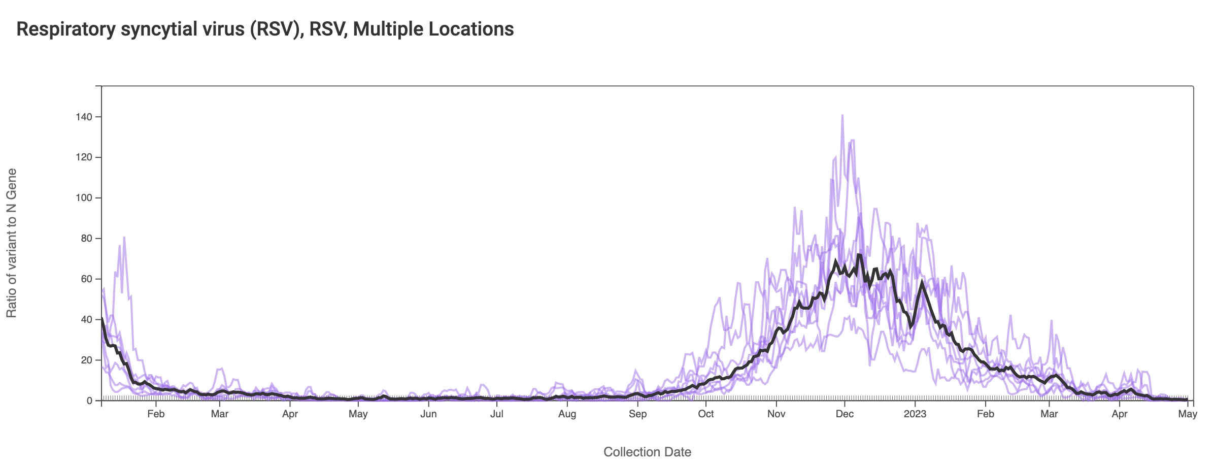
RSV RNA has been non-detectable in most samples in the past week. This plot shows data from all the SCAN sites together since last winter and can be access here. The black line is the population weighted average.
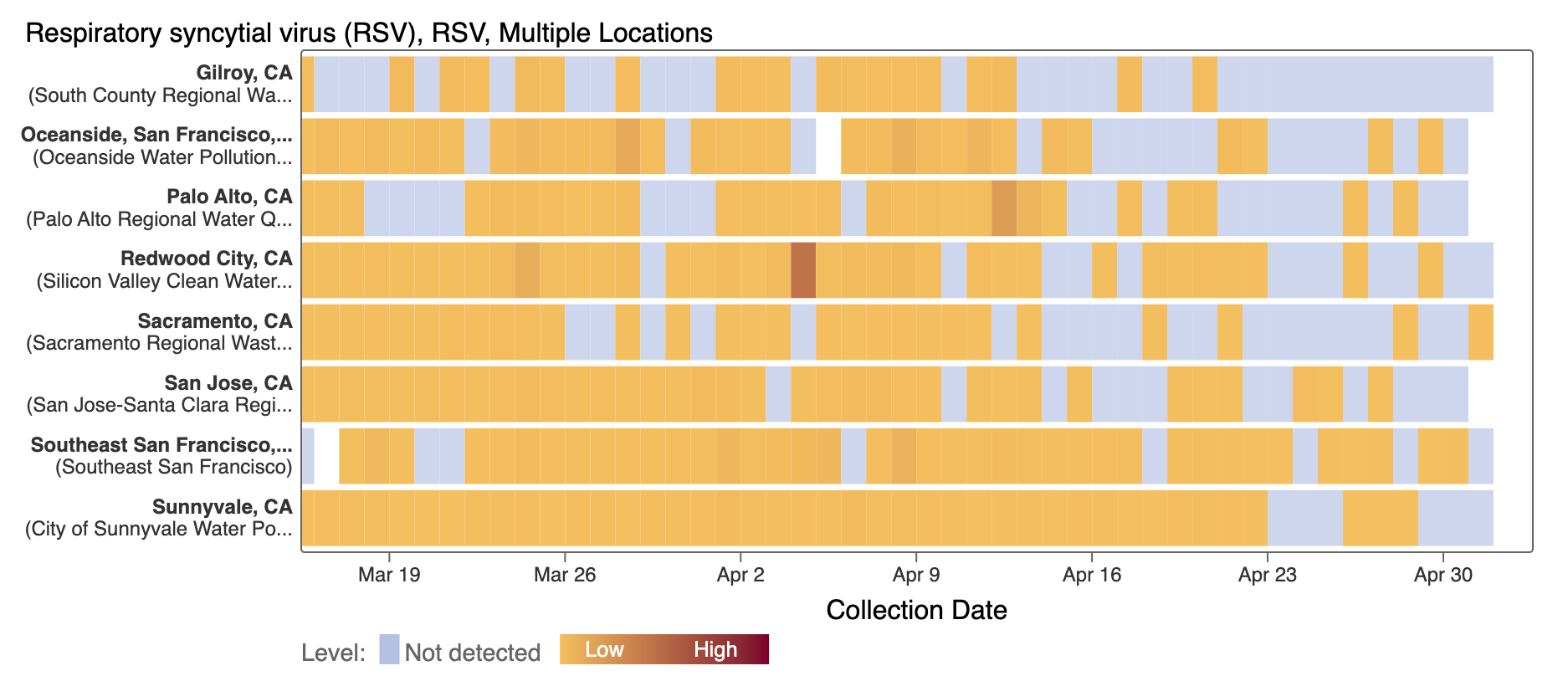
The heat map below shows the recent more frequent occurrence of non-detects for RSV.
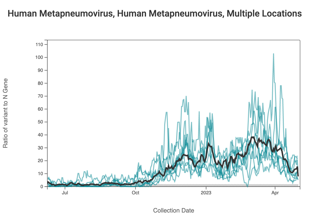
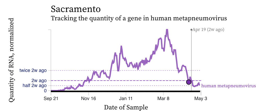
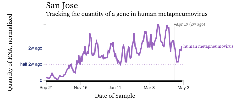
HMPV (human metapneumovirus) RNA concentrations are coming down across most of plants in SCAN. Below are charts showing data from all the SCAN plants together (link here to this chart if you want to interact with it), and just Sacramento and San Jose. At Sacramento levels have come down quite a bit, but in San Jose they are still elevated despite looking like they were going to come down last week.
Norovirus
Assay detects human norovirus GII
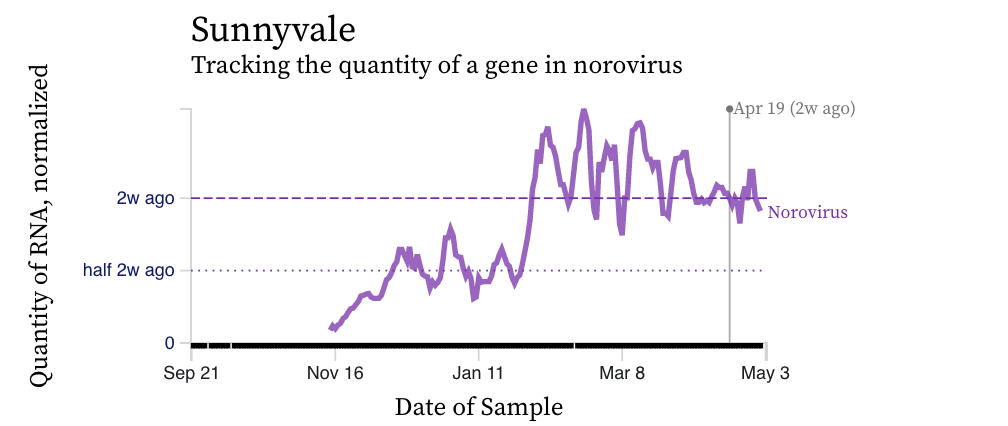
Norovirus GII RNA concentrations have taken a down turn at most, but not all plants. A chart of all the SCAN plants together is shown below. The population weighted average line is shown in black, and that line shows a decrease over the last couple weeks. You can interact with the chart of all the plants at this link. The chart from Sunnyvale shows that norovirus RNA concentrations have been fairly constant over the last two weeks, and other individual plants have similar partners.
Mpox
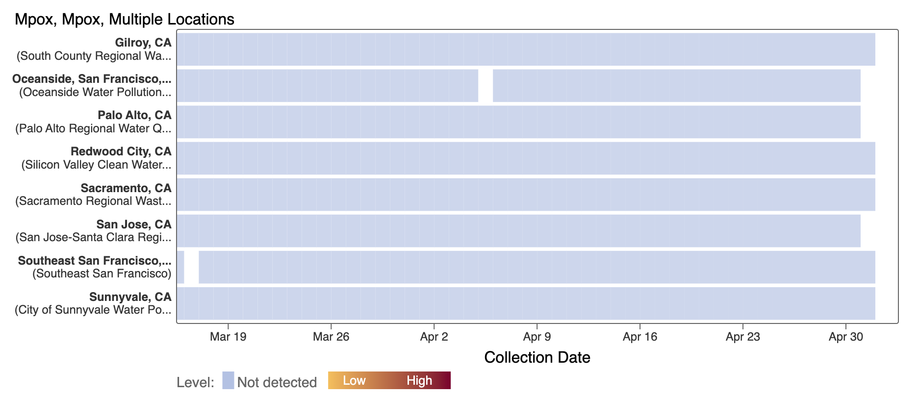
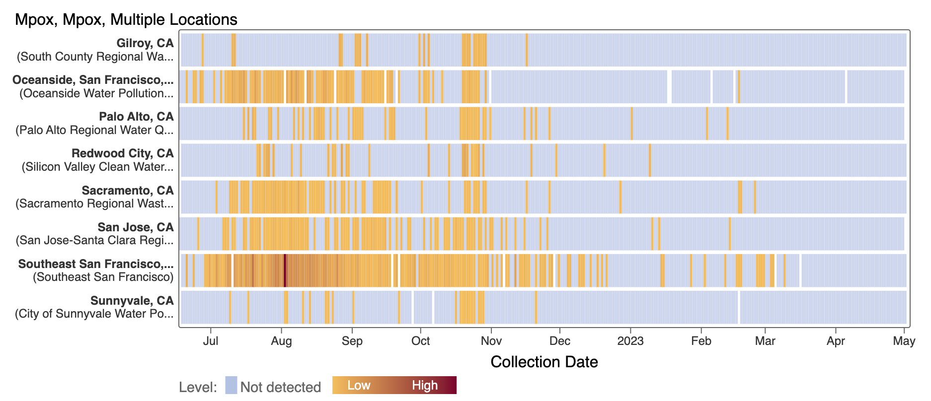
We've observed non-detects in the last 6 weeks for MPXV DNA at the SCAN plants. These heat maps show all the SCAN sites as a row, and each date as a column. The color blue means the sample was non-detect for MPXV DNA and the colors get darker with higher concentrations. The top chart shows just recent data, and the bottom one all the data we have collected, almost a year's worth of data. You can access these plots here.